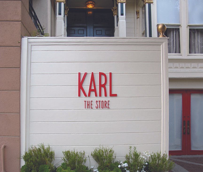
Named affectionately after Karl the (San Francisco Bay Area) Fog, this retail boutique rejects Trash Culture in favour of curation, craftsmanship, and experience.

BRAND
Concept and direction:
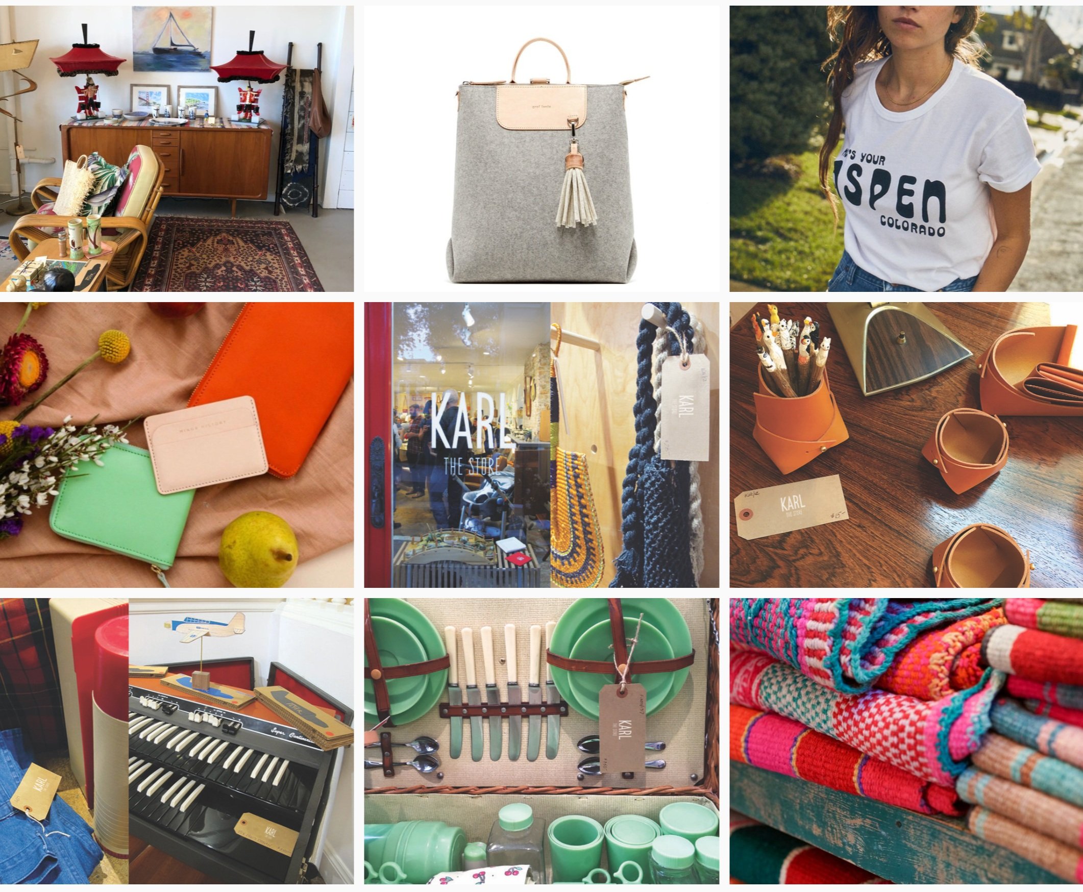
Brand values celebrated the luxurious, eclectic and one-of-a-kind curation. Mid-century modernism is a key cornerstone of the brand.
Identity:
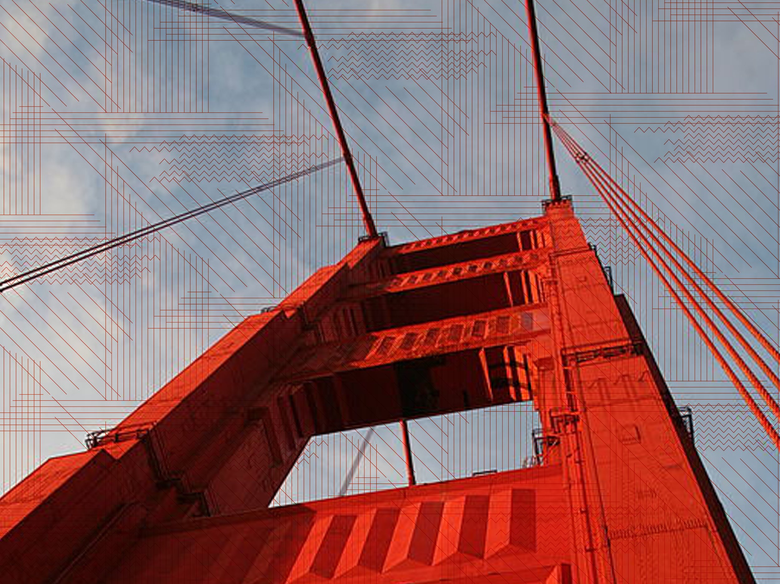
Custom logotype developed using the mathematical geometry of the relationship between the Golden Gate bridge, the Bay, and surrounding topography.

Color: Calling on the colours of the Bay Area, vibrant warm red* meets cool, foggy blue. The extended palette has a quirky, rock-inspired edge while having relationship with mid-century modernism.
*The famed Golden Gate bridge is actually orange. After extensive color research and soul searching, we decided to choose a hot, orange-tinged red for the brand color instead of the historically accurate orange.
Aligning to the brand: Memory is rarely accurate, but always rose-tinted.
Collateral
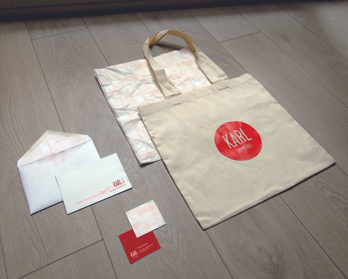
Graphics:
The graphic vocabulary started with the logotype. Linear, abstracted landscape and topographic geometry reminded me of the process used to weave mid-century textiles. This drove the character of the custom Woven Karl print used across collateral assets.
Retail
Experience:
The customer flow and the type of experience the owners wanted to create defined the nature of the experience. SoCal ease with a rock-inspired edge were key to the vibe. Working with collaborators who have impeccable taste and high standards is always a bonus!